Despite being a proud Indonesian with having raised there for 17 years in the small regency called Banten in the island of Java, shamelessly I admit that I’ve never seen or heard a lot of places Indonesia has to offer. But it is in my bucketlist and dreamt that I would someday backpack around it.
In my defence, Indonesia is the world’s largest archipelagic country with over 17,000 islands. You will never run out of beautiful places to explore, cuisines to try, cultures to experience. It’s nearly impossible to know where or what everything is. This was a problem I’d like to solve for myself!

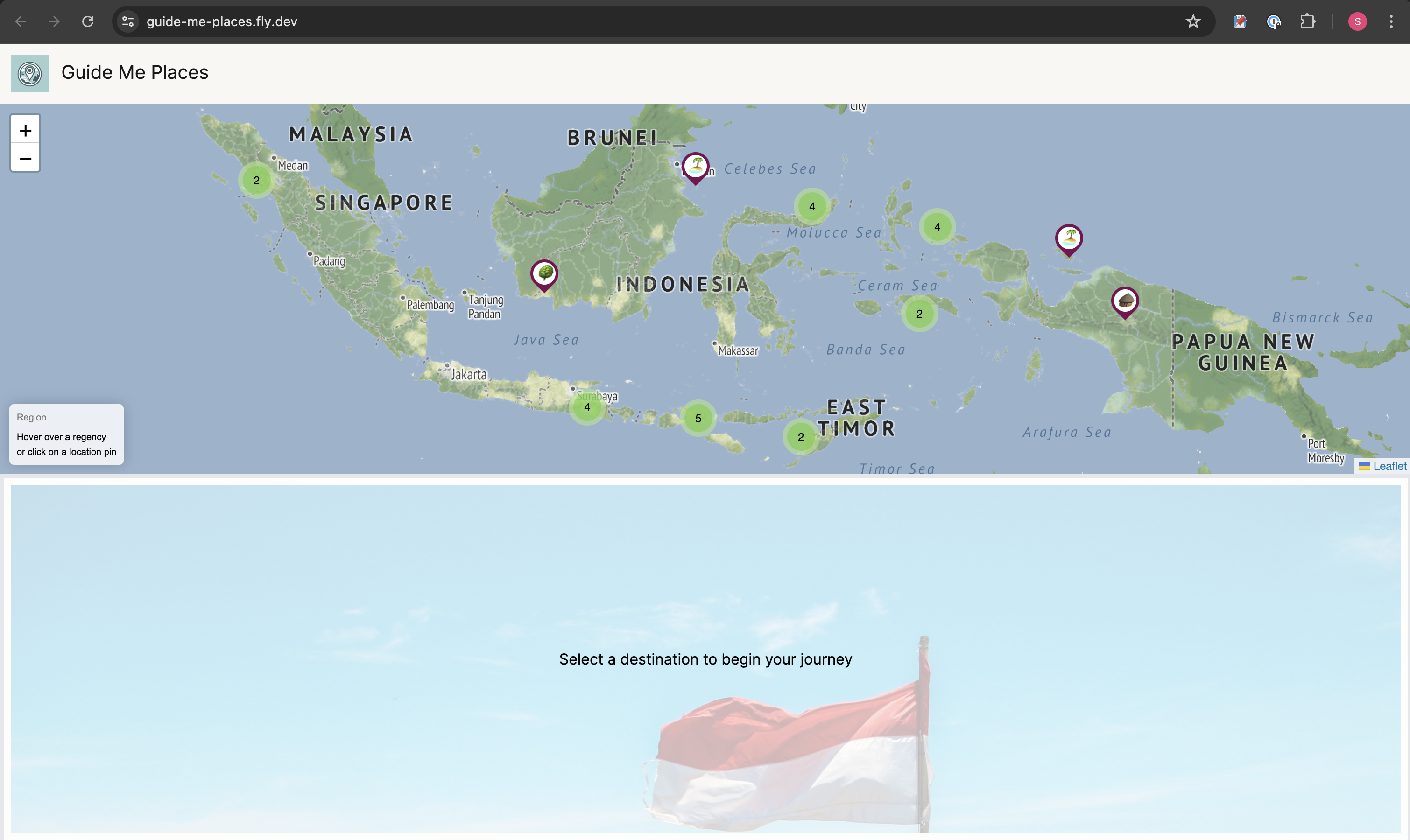
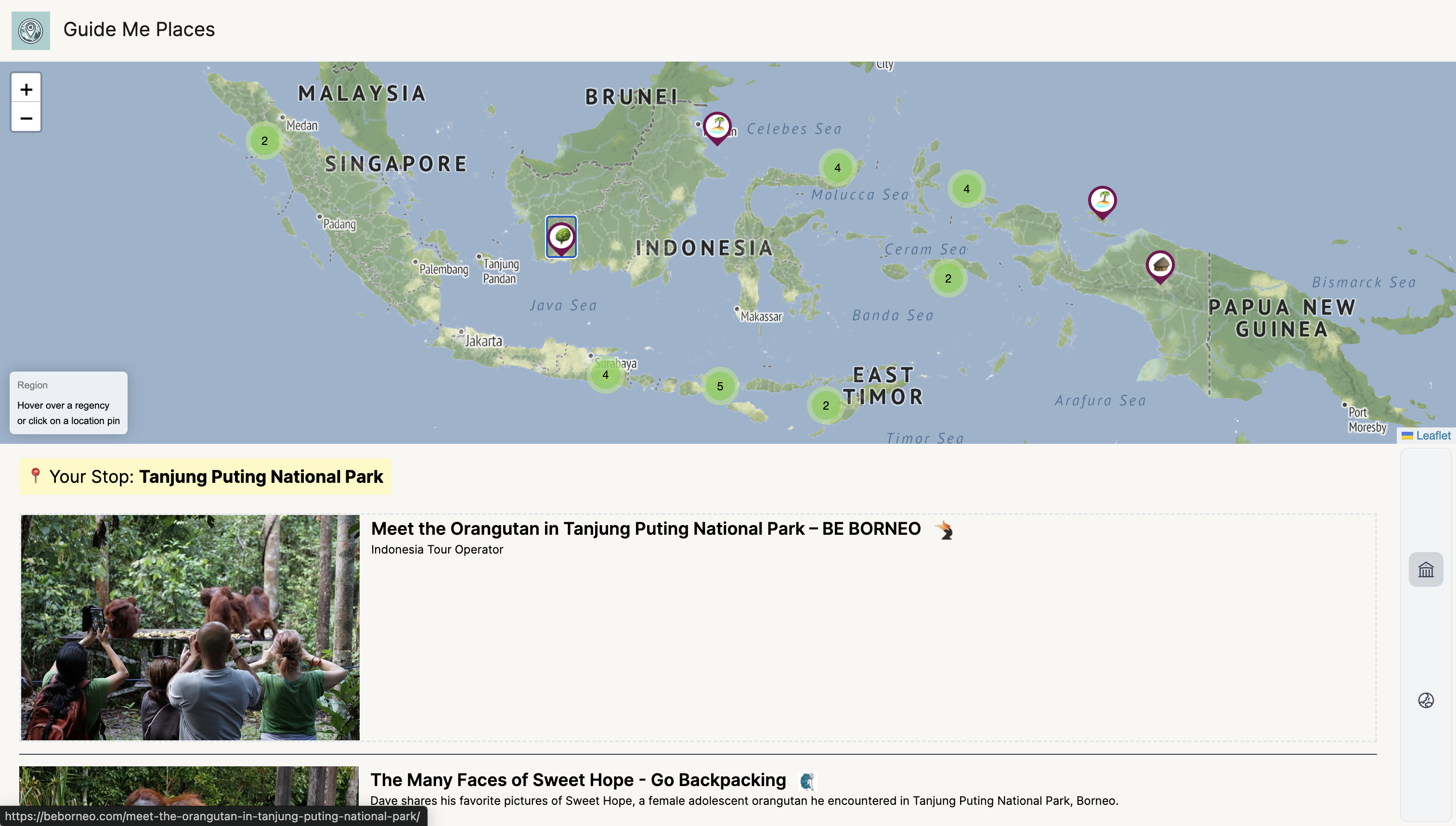
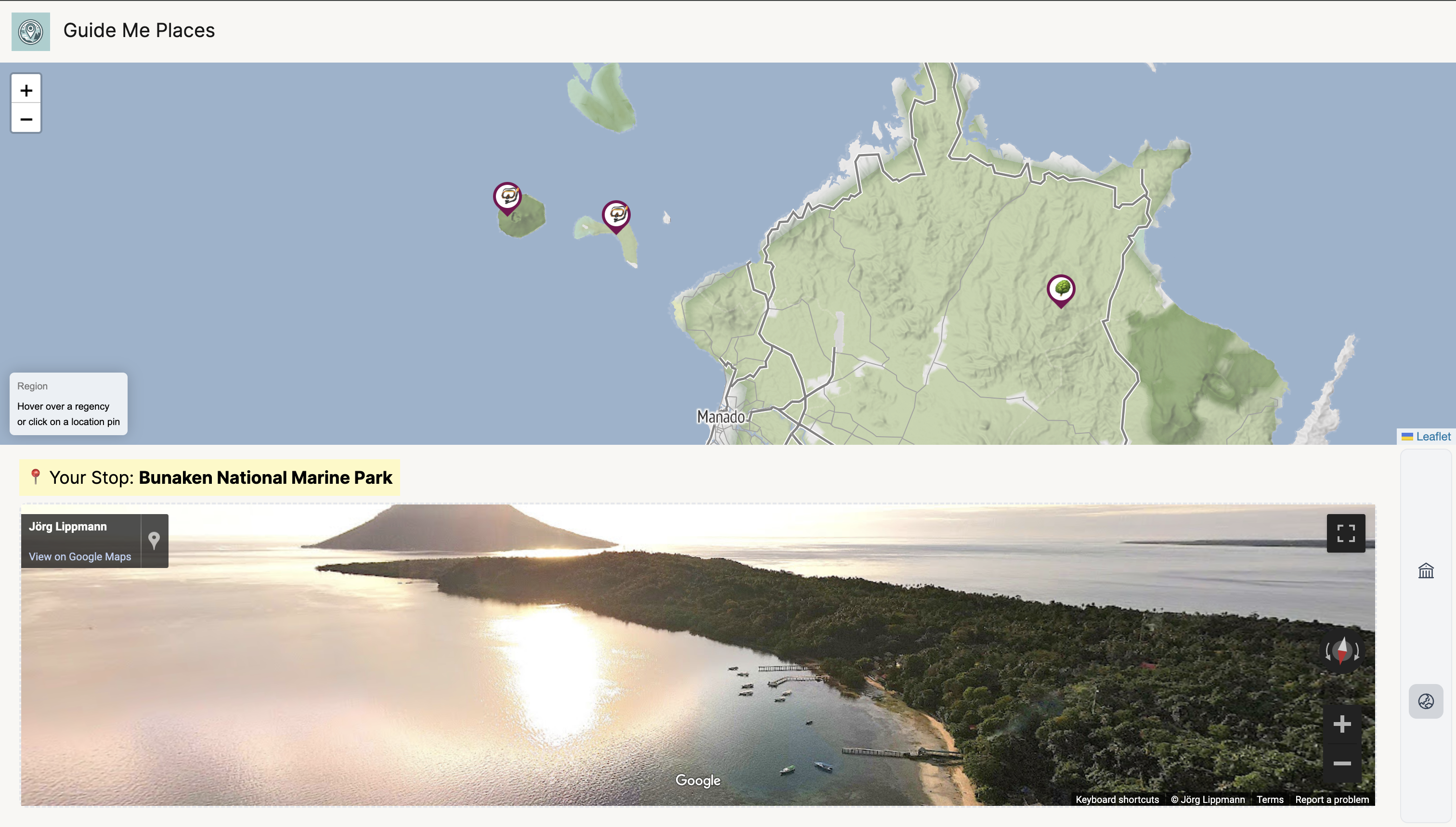
Guide Me Places is a side-project I built recently. I curate places to visit, and display coordinates 📍 in an interactive map to help people like me discover and explore all corners of Indonesia. On top of that, I’ve curated a feed of articles and stories from fellow travelers users can browse through when they select a location in the map.
Check it out 👉 https://guide-me-places.fly.dev/


How it was built
Leaflet
It’s my first time tinkering with rendering an interactive map, but leaflet makes it so easy. In all plain JS, I would initialize the map and add a tile layer to the map.
These tile layers are the image assets rendered on screen provided by a tile providers like OpenStreetMap, Mapbox, Stamen, via HTTP (preview a list of them here). I’m using one by Stadiamap and the free version allows 200k tiles/month (pricing).
Next, add in each marker/polygons/popups to the map giving it the coordinates. For each object on the map, you could attach events (ie. execute something on click).
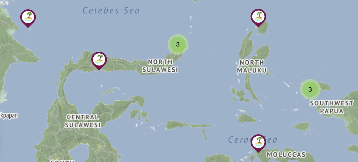
I wanted to customize my map marker to show emojis. This was easy to do as leaflet lets you override the marker with HTML content.
const marker = L.marker([lat, long], {icon: markerIcons(emoji)})

markerIcons = (emoji) => (
  L.divIcon({
    className: 'custom-div-icon',
    html: `<div class='marker-pin'></div><i>${emoji}</i>`,
    iconSize: [30, 42],
    iconAnchor: [15, 42] // half of width + height
  })
)
Another cool plugin for leaflet is Marker Cluster (github). When you zoom the map further out and have tons of markers in one area of the map, you could abstract it away with a number indication of how many markers are within that area. This is straightforward to implement - instead of adding the markers to the map, you add the markers to a ‘marker cluster group’ and add that group to your map. It would automatically animate into view as you zoom in and out. Walaah ✨

Rails
I love Rails, but I gotta admit using Rails MVP app for this is a little overkill when it’s just a single-page app. Could’ve easily been a static app.
My first implementation was to just pull the article and location data (Airtable / Google Sheets API) on render. But I decided to move it all to SQLite DB running on the same machine as my server to perhaps shave-off the render time. I made a handy rake task that I can execute to batch refresh the data and sync it with Airtable / Google Sheets.
I deployed them to Fly.io for free. Did face an issue where the machine kept restarting causing page load time to >30s. Took me a while to realize it wasn’t a performance issue of my app 😅. I resolved it by removing the health checks 🙈🙉🙊.
Curation tools
I used Airtable and Google Sheets to keep track of my location and articles. Honestly, I just need Airtable (will leave the migration as a tech debt) so I don’t need to manage 2 types of integrations. Although it was nice to learn how to do both, and know that I could use them at my disposal.
I also used automation tools like IOS shortcut to easily save url to airtable, and a custom scraping tool to extract article data from URL.
Future plans
- Using the same map system to curate many things.
- Monetization ideas:
- Freemium feature to save locations
- Affiliate links / promote travel hosts, flights, hotels, tours
- I’ll stick with donations for now 🙏 I included a buy me coffee page on the header.
- A travel newsletter
- Participation (submission, ratings, comments)